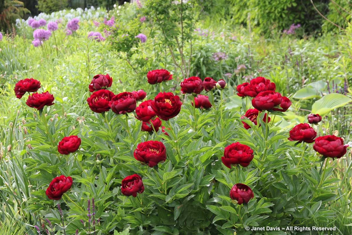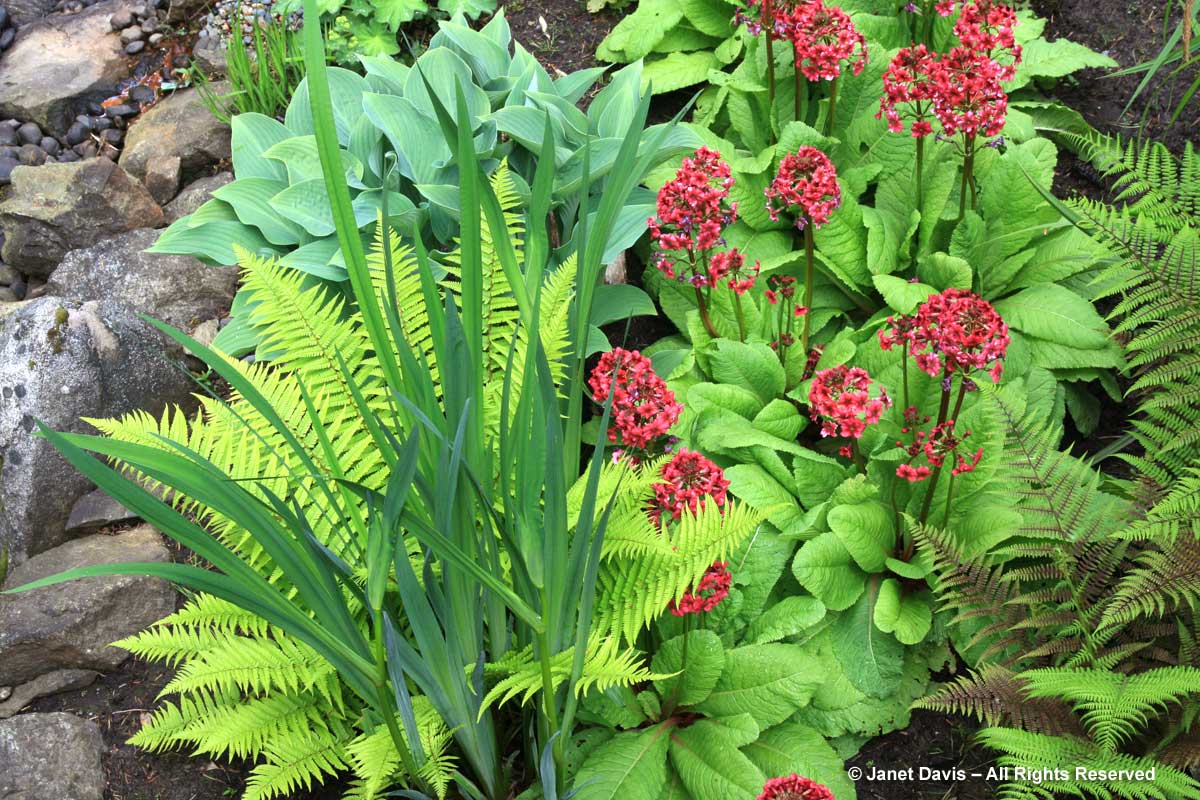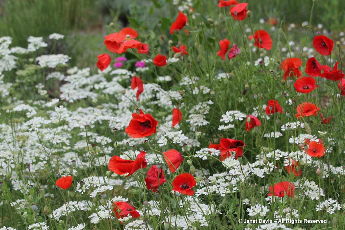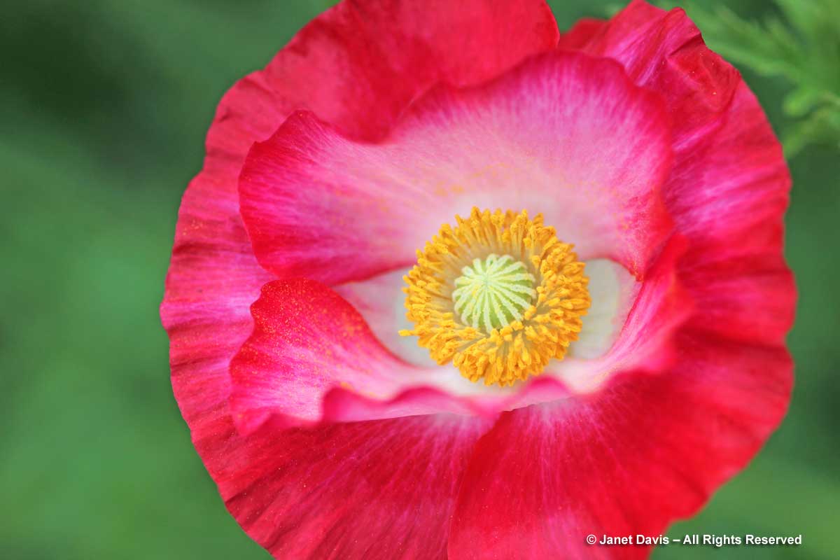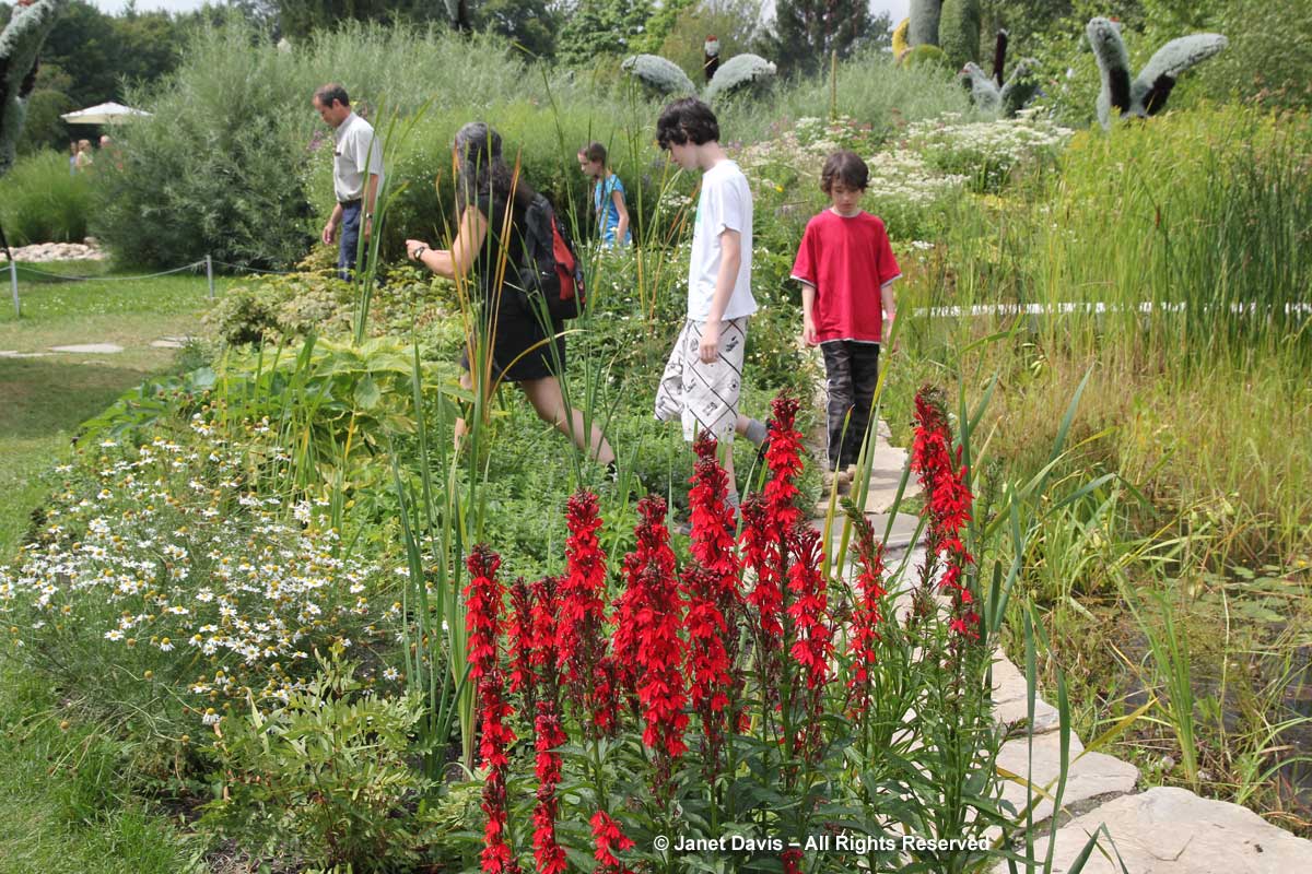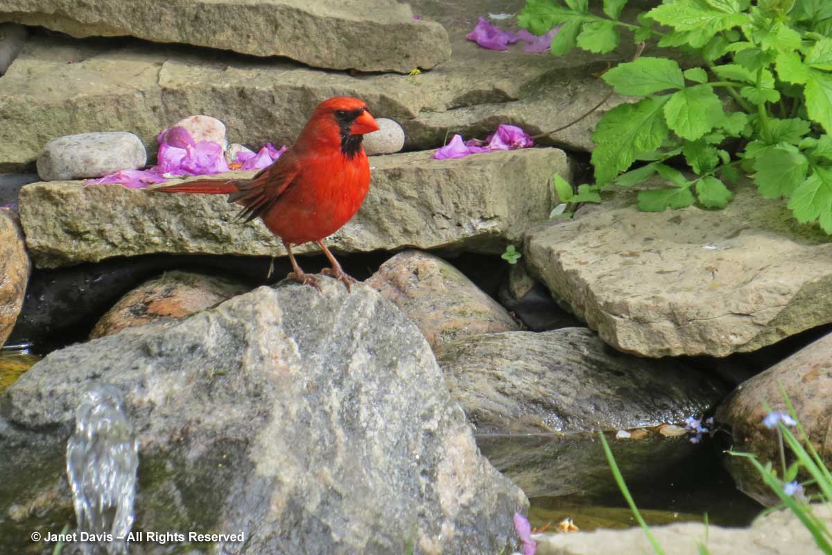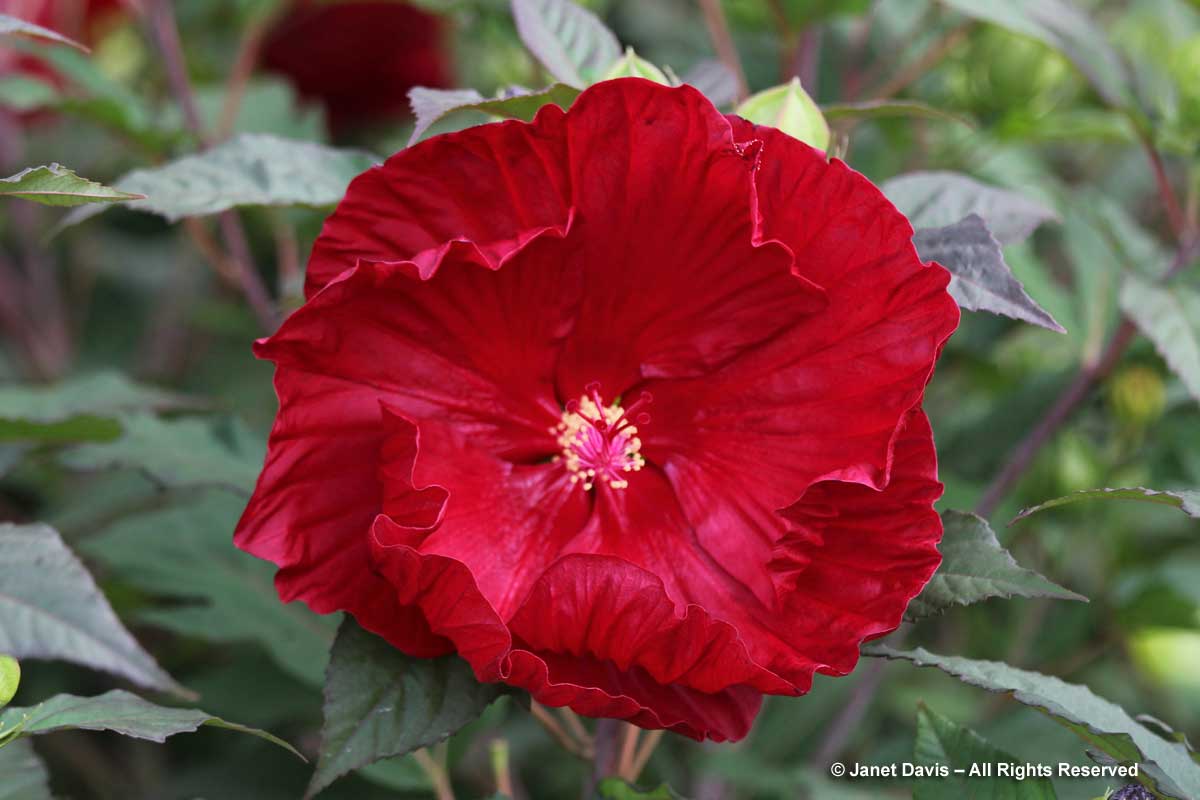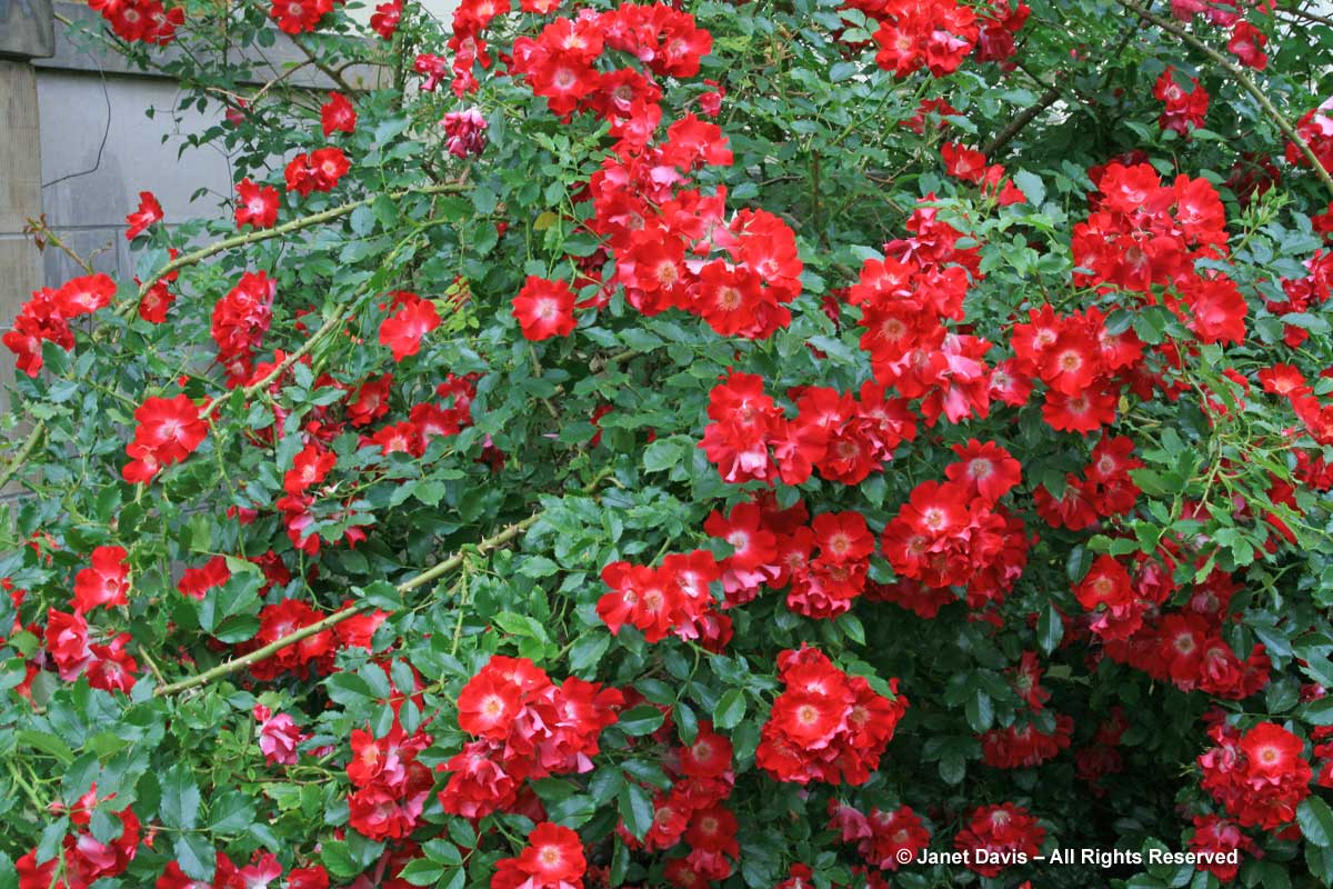
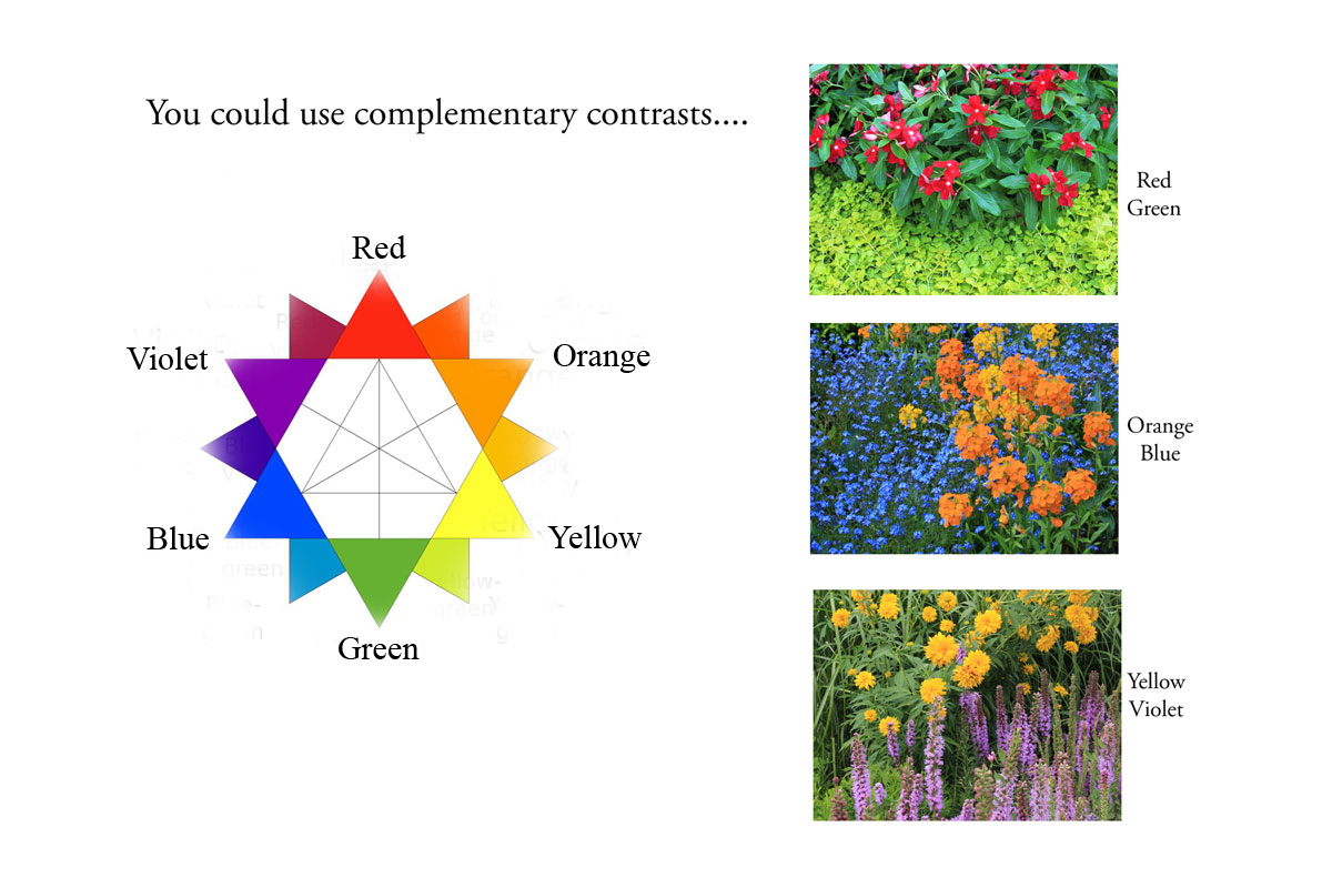
While my earlier February post focused on some of my favourite red flowers for the garden, I want to spend just a little time talking about a principle of colour theory that, at least in the case of red, is a textbook example of visually pleasing complementary contrast. You remember that from art theory, right? Colours that appear opposite each other on the artist’s colour wheel are said to be “complementary contrasts” and there is a harmony about them. While not everyone might feel that way about orange & blue, the use of lots of restful green foliage to frame brilliant red blossoms seems like an obvious design approach.
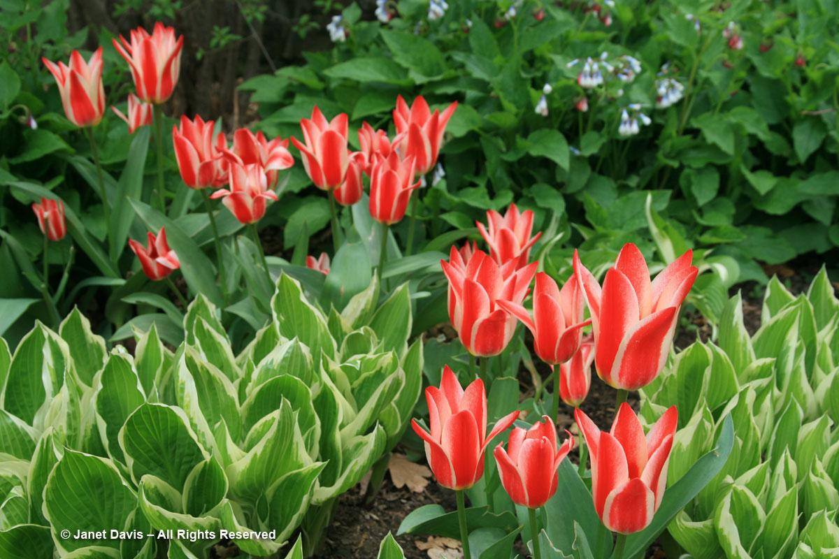
Since a picture is worth a thousand words, let’s look at a few examples I’ve collected over the years. How about these sweet red tulips popping up amidst fresh hosta foliage, at Toronto’s Casa Loma? So much more lovely than emerging in bare spring soil.
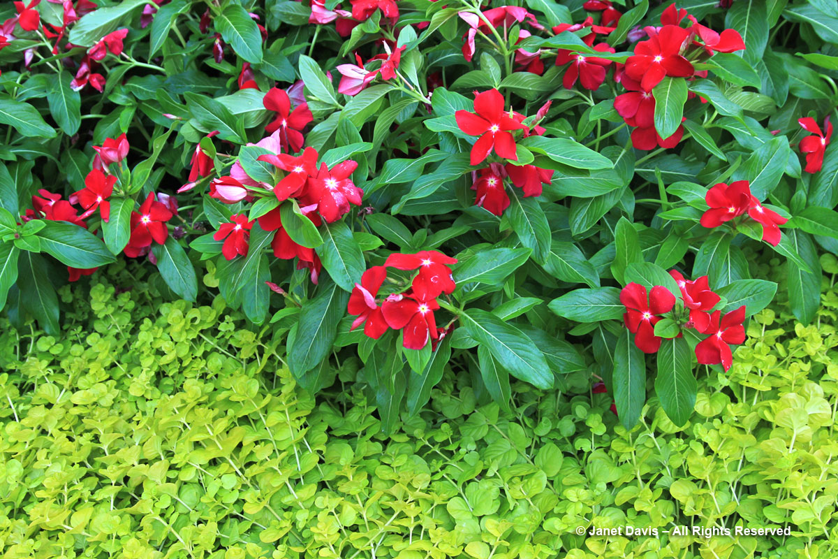
And look how pretty this bright ‘Pacifica XP Really Red’ vinca (Catharanthus roseus) is when paired with the chartreuse-green groundcover creeping Jenny (Lysimachia nummularia ‘Goldilocks’) at Missouri Botanical Garden.
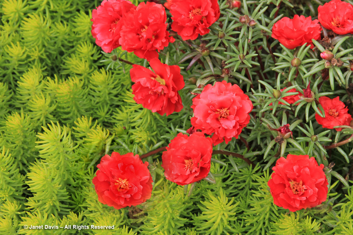
The deservedly popular perennial stonecrop Sedum rupestre ‘Angelina’ makes a fabulous carpet for this annual red portulaca at the Royal Botanical Garden in Hamilton, Ontario.
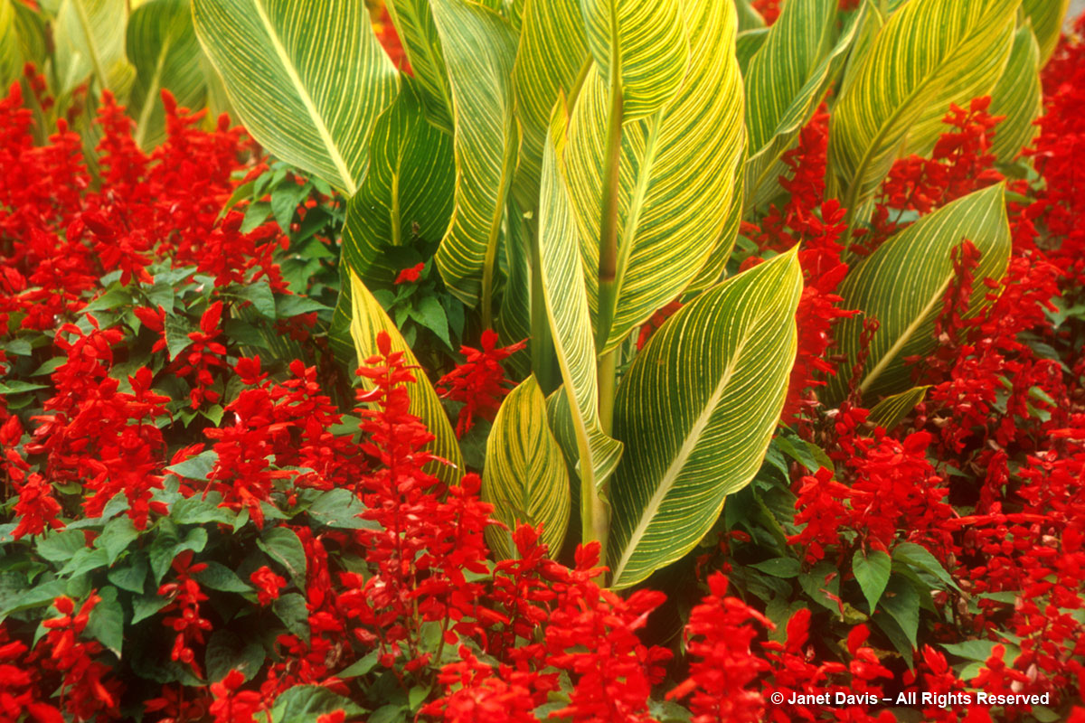
How about some tropicals? I was wowed by this juxtaposition of dumpy little red salvia (S. splendens) and Canna ‘Pretoria’ at Stanley Park, Vancouver, B.C.
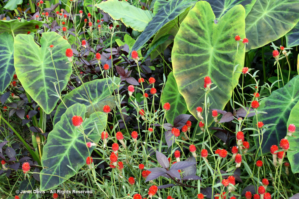
And I loved this combination of (very underused) Gomphrena globosa ‘Strawberry Fields’ with the taro Colocasia esculenta ‘Illustris’ at Sarah P. Duke Gardens in Durham, North Carolina.
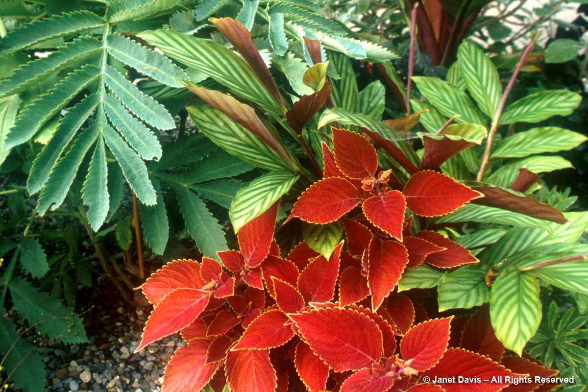
This little ensemble of red coleus and honeybush (Melianthus major) with other tropical foliage plants took my eye at Chanticleer Garden in Wayne, PA many years ago.
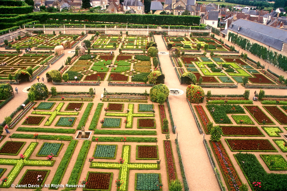
Of course, you don’t have to think small when considering designing a garden using plants featuring red-and-green complementary contrast. Even a humble vegetable patch, like this one at Chateau Villandry, in France’s Loire Valley, illustrates my colour theory!
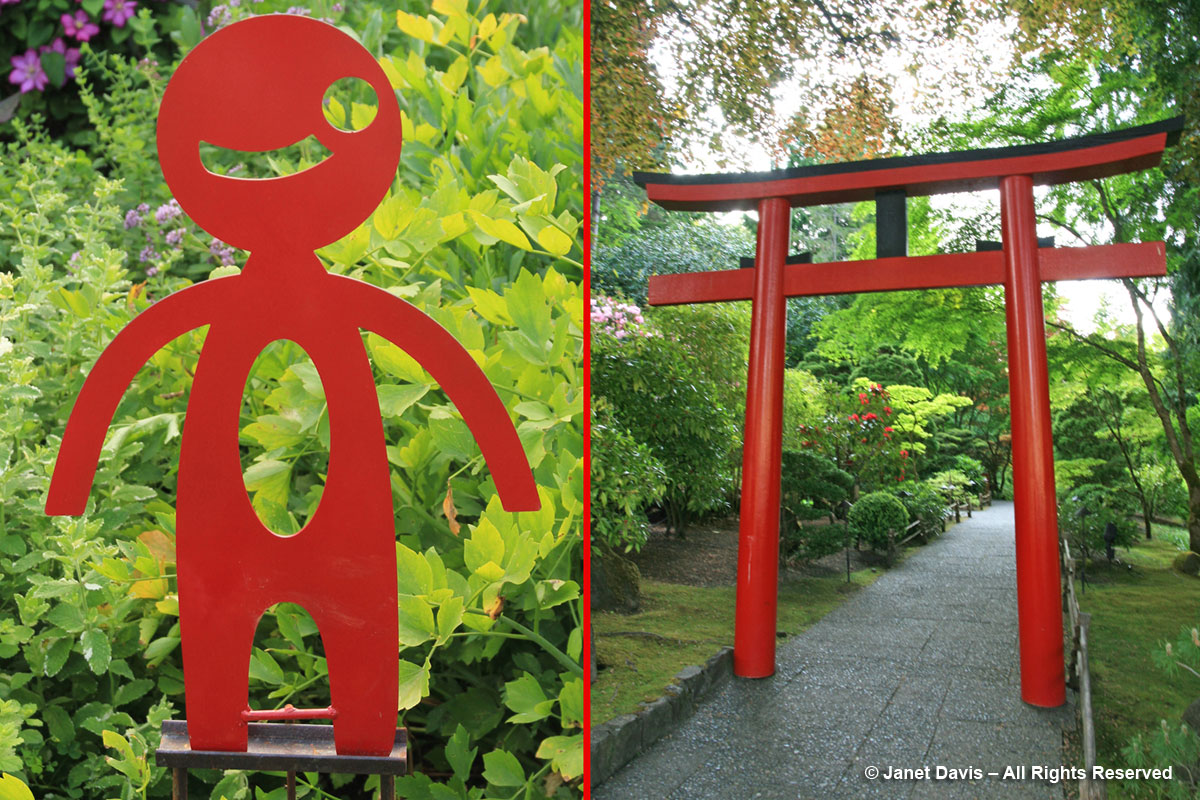
And the concept works with garden furnishings too, as you can see with the sweet little iron sculpture from Toronto’s Mark Clark, left, and the traditional torii gate leading into the Japanese Garden at Victoria’s Butchart Gardens, right.
Be sure to come back in March, when I’ll explore that most important of garden hues: chlorophyll-green.